
Building a tab control component for iOS and Android with React Native
A tab control is a crucial component for mobile apps. It enables users to navigate between screens or makes different portions of on-screen content accessible by switching between views.
As a mobile app developer, you’d typically utilize a segmented control on iOS.
Originally published at blog.logrocket.com
On Android, you’d normally use tab layouts according to Material Design guidelines.
The goal of this article is to develop a React Native component that renders a segmented control on iOS and a tab component on Android. When it comes to implementation, I reuse code for state management and data flow because they are platform-independent.
Platform-specific code — e.g., due to different UI patterns — is used with the help of React Native mechanisms like the Platform module to distinguish between iOS and Android (as well as Web). My requirements on the component are:
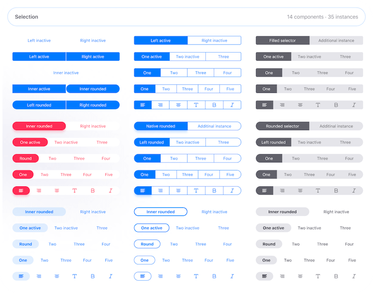
- The Android component meets Material Design guidelines
- The iOS component design is strongly oriented towards iOS 13’s design of segmented control. My template is Apple Maps on iOS 13
- I do not attempt to implement different designs for different operating system versions (e.g., no iOS 12 design of segmented control for users with iOS 12)
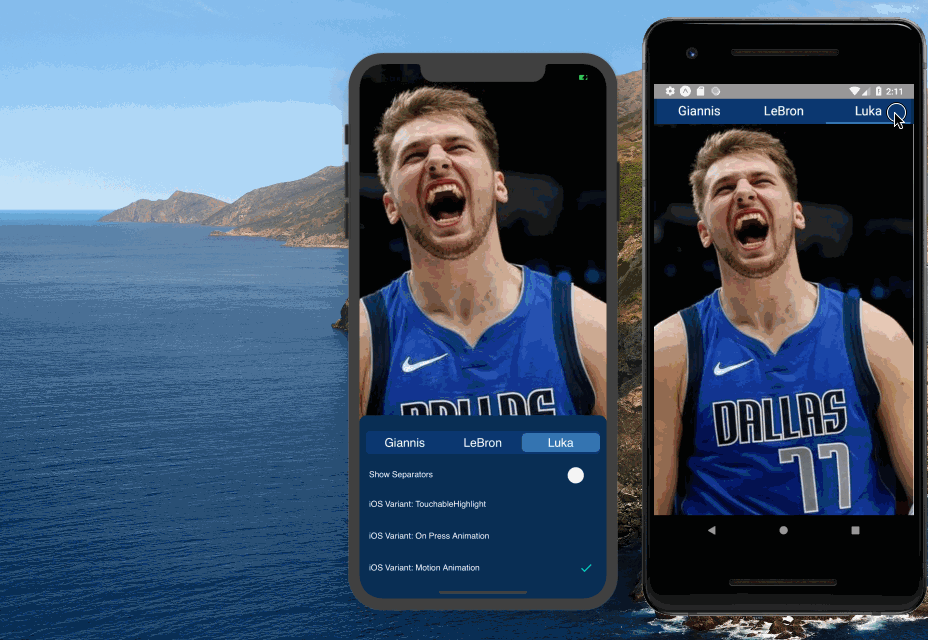
Demo app
The following animated gif demonstrates the tab control that is the subject of this article. You can find this project on Github or as a publicly available Expo project.
I want to focus on the important aspects of developing such a component. For this reason, I have broken the example down to the essentials.
With respect to segmented control, I implemented a version using a motion animation for the interaction concept to visualize the transition between active tabs. In the animated gif above, you can see how this UX pattern looks (iOS Variant: Motion Animation).
You can find the code in my Github project or you can have quick access via my Expo Snack.
TabControl — interface and implementation
The interface of the TabControl component looks like this.
    <TabControl
      values={["Giannis", "LeBron", "Luka"]}
      onChange={value => {
        if (value === "Giannis") {
          setImgSource(sourceUriGiannis);
        } else if (value === "LeBron") {
          setImgSource(sourceUriLeBron);
        } else {
          setImgSource(sourceUriLuka);
        }
      }}
      renderSeparators={showSeparatorsIos}
    />
You have to pass in an array of values that are rendered as tab labels. The onChange prop is called when the user taps on a tab. The callback function gets the label of the active tab. In the demo project, I used the value to set the image source (setImgSource) in order to change the background image whenever the user presses a tab.
Let’s drill into the implementation details of the TabControl component.
    import {
      // ...
      Platform
    } from "react-native";
    import iosTabControlStyles from "./iOSTabControlStyles";
    import androidTabControlStyles from "./androidTabControlStyles";
    const isIos = Platform.OS === "ios";
    const wrapperStyles = StyleSheet.create({
      outerGapStyle: isIos ? { padding: theme.spacing.s } : { padding: 0 }
    });
    const tabControlStyles = isIos ? iosTabControlStyles : androidTabControlStyles;
    const TabControl = ({ values, onChange, renderSeparators }) => {
      const [selectedIndex, setSelectedIndex] = useState(0);
      const handleIndexChange = index => {
        setSelectedIndex(index);
        onChange(values[index]);
      };
      return (
        <View style={wrapperStyles.outerGapStyle}>
          <SegmentedControl
            values={values}
            selectedIndex={selectedIndex}
            onIndexChange={handleIndexChange}
            renderSeparators={renderSeparators}
          />
        </View>
      );
    };
I utilized React Native’s Platform API to render the component differently on both mobile platforms. I created a boolean variable (isIos) to easily perform platform checks throughout the component.
    import iosTabControlStyles from "./iOSTabControlStyles";
    import androidTabControlStyles from "./androidTabControlStyles";
    const isIos = Platform.OS === "ios";
    const wrapperStyles = StyleSheet.create({
      outerGapStyle: isIos ? { padding: theme.spacing.s } : { padding: 0 }
    });
    const tabControlStyles = isIos ? iosTabControlStyles : androidTabControlStyles;
With the wrapperStyles object, you can see how I define different style properties. On Android, the component should stretch across the whole viewport width, but on iOS, there should be a small gap on the left and right sides.
Depending on the platform, iOSTabControlStyles or androidTabControlStyles are assigned to tabControlStyles. This object holds the actual styles and is accessed from different parts throughout the component. The idea behind this concept is that both imported style objects have the same “interface.” Let’s take a look at the Android styles (androidTabControlStyles.js).
    import { StyleSheet } from "react-native";
    import theme from "../theme";
    const { tabsContainerColor, borderColor, activeTextColor } = theme.color;
    export const androidTabBarHeight = 40;
    const fontStyles = {
      fontFamily: theme.fontFamily.normal,
      fontSize: theme.fontSize.l,
      color: activeTextColor
    };
    const gap = theme.spacing.s;
    export default StyleSheet.create({
      tabsContainerStyle: {
        backgroundColor: tabsContainerColor,
        height: androidTabBarHeight
      },
      tabStyle: {
        flex: 1,
        paddingVertical: gap,
        paddingHorizontal: 2 * gap
      },
      tabTextStyle: { ...fontStyles, alignSelf: "center" },
      activeTabStyle: {
        borderBottomWidth: theme.spacing.xs,
        borderBottomColor: borderColor
      },
      activeTabTextStyle: {
        ...fontStyles
      },
      firstTabStyle: {},
      lastTabStyle: {}
    });
Concrete values for colors, spacing, or fonts are defined in the imported theme.js file. As an example, theme.fontSize.l assigns a large font size.
The stylesheet object for iOS has the same structure (iOSTabControlStyles.js). Of course, the values are different. The following prop type shows the “interface.”
      import { ViewPropTypes } from "react-native";
      // ...
      const styleShape = PropType.shape({
        tabsContainerStyle: ViewPropTypes.styles,
        tabStyle: ViewPropTypes.styles,
        tabTextStyle: ViewPropTypes.styles,
        activeTabStyle: ViewPropTypes.styles,
        activeTabTextStyle: ViewPropTypes.styles,
        firstTabStyle: ViewPropTypes.styles,
        lastTabStyle: ViewPropTypes.styles
      });
The TabControl component assumes that these properties exist on the stylesheet object. For reasons of clarity, I’ll skip the details of the iOS stylesheet object.
TabControl is a stateful component that stores the selected index (selectedIndex). In addition, it defines a function (handleIndexChange) to change the selected index and invokes the passed onChange callback — in our case, to change the background image.
    const TabControl = ({ values, onChange, renderSeparators }) => {
      const [selectedIndex, setSelectedIndex] = useState(0);
      const handleIndexChange = index => {
        setSelectedIndex(index);
        onChange(values[index]);
      };
      return (
        <View style={wrapperStyles.outerGapStyle}>
          <SegmentedControl
            values={values}
            selectedIndex={selectedIndex}
            onIndexChange={handleIndexChange}
            renderSeparators={renderSeparators}
          />
        </View>
      );
    };
The component renders a SegmentedControl component inside of a container with the aforementioned horizontal paddings. values and renderSeparators, a boolean flag to control whether separators should be rendered on iOS, are passed as props along with the press handler and the index of the active tab.
SegmentedControl — rendering of tabs in a platform-agnostic container
SegmentedControl is responsible to render a Tab component for every entry of the tabValues array.
    function SegmentedControl({
      values: tabValues,
      selectedIndex,
      onIndexChange,
      renderSeparators,
    }) {
      return (
        <Container
          style={tabControlStyles}
          numberValues={tabValues.length}
          activeTabIndex={selectedIndex}
        >
          {tabValues.map((tabValue, index) => (
            <Tab
              label={tabValue}
              onPress={() => {
                onIndexChange(index);
              }}
              isActive={selectedIndex === index}
              isFirst={index === 0}
              isLast={index === tabValues.length - 1}
              renderLeftSeparator={
                renderSeparators && shouldRenderLeftSeparator(index, selectedIndex)
              }
              key={tabValue}
            />
          ))}
        </Container>
      );
    }
The tab label and the tab press callback function are passed on to the Tab component. isActive, isFirst, and isLast tell the Tab component the correct context to render the tabs differently (e.g., a bottom border for an active tab on Android). The context is determined by the current index and selected index. renderLeftSeperators represents a boolean flag that determines whether a separator on the left side of the tab should be rendered (this is the implementation decision).
I’ll skip the implementation detail of the function shouldRenderLeftSeparator. In short, the separator for a tab is rendered for all tabs on the iOS platform if they are not the first or active tab, or if the previous tab constitutes the active tab.
Container — horizontal layout component with motion animation on iOS
The Container component renders differently on iOS and Android. Of course, the children prop constitutes the map of Tab components. numberValues and activeTabIndex are used to calculate the new state of the animation.
    function Container({
      children,
      numberValues,
      style,
      activeTabIndex
    }) {
      const { tabStyle, activeTabStyle, tabsContainerStyle } = style;
      const margin = theme.spacing.s;
      const [moveAnimation] = useState(new Animated.Value(0));
      const [containerWidth, setContainerWidth] = useState(0);
      useEffect(() => {
        const leftVal = (containerWidth / numberValues) * activeTabIndex;
        Animated.timing(moveAnimation, {
          toValue: leftVal,
          duration: 250
          // not supported by native animated module
          // useNativeDriver: true
        }).start();
      }, [containerWidth, activeTabIndex]);
      return isIos ? (
        <View
          style={[
            {
              marginHorizontal: margin,
              flexDirection: "row",
              position: "relative"
            },
            tabsContainerStyle
          ]}
          onLayout={event => {
            setContainerWidth(event.nativeEvent.layout.width);
          }}
        >
          <Animated.View

            style={{
              // works too
              // width: `${100 / numberValues}%`,
              width: containerWidth / numberValues,
              left: moveAnimation,
              top: iosTabVerticalSpacing,
              bottom: iosTabVerticalSpacing,
              position: "absolute",
              ...tabStyle,
              ...activeTabStyle
            }}

          ></Animated.View>
          {children}
        </View>
      ) : (
        <View
          style={[
            { marginHorizontal: margin, flexDirection: "row" },
            tabsContainerStyle
          ]}
        >
          {children}
        </View>
      );
    }
The easy part is the Android version (the second expression of the ternary operator). It’s just a tiny bit of JSX code that wraps the children in a View tag with some margin on the left and right sides (marginHorizontal).
flexDirection: "row" is required to render the tabs side by side since the default direction is column, in contrast to the W3C/web version of Flexbox.
tabsContainerStyle is destructured from the passed style prop and defines the background color and height of the container component (androidTabControlStyles.js).
    return isIos ? (
        // iOS version / animation code
      ) : (
        // Android version
        <View
          style={[
            { marginHorizontal: margin, flexDirection: "row" },
            tabsContainerStyle
          ]}
        >
          {children}
        </View>
      )
The iOS version is more complex.
    // ...
      const [moveAnimation] = useState(new Animated.Value(0));
      const [containerWidth, setContainerWidth] = useState(0);
      useEffect(() => {
        const leftVal = (containerWidth / numberValues) * activeTabIndex;
        Animated.timing(moveAnimation, {
          toValue: leftVal,
          duration: 250
          // not supported by native animated module
          // useNativeDriver: true
        }).start();
      }, [containerWidth, activeTabIndex]);
      return isIos ? (
        <View
          style={[
            {
              marginHorizontal: margin,
              flexDirection: "row",
              position: "relative"
            },
            tabsContainerStyle
          ]}
          onLayout={event => {
            setContainerWidth(event.nativeEvent.layout.width);
          }}
        >
          <Animated.View
            style=
          ></Animated.View>
          {children}
        </View>
      ) : (
        // Android version
      )
I decided to use two state objects to manage the animation. containerWidth holds the width of the container object. setContainerWidth is called inside the callback function assigned to View’s onLayout prop. event.nativeEvent.layout.width returns the actual width of the component.
The array assigned to the style prop looks very similar to the Android version as described above. The only difference is position: "relative" because the implementation of the active tab animation (Animated.View) uses absolute positioning.
    <View style={[
        {
          marginHorizontal: margin,
          flexDirection: "row",
          position: "relative"
        },
        tabsContainerStyle
      ]}
      onLayout={event => {
        setContainerWidth(event.nativeEvent.layout.width);
      }}>
      <Animated.View>
        // ...
      </Animated.View>
      {children}
    </View>
Animated is React Native’s animation library. Animated.View is an enhanced View component positioned absolutely in the relatively positioned parent component.
It does not have any children because the only purpose is to have a styled component with background color and rounded corners that is animated on the horizontal axis by updating the left property.
width is calculated dynamically based on the number of tabs (numberValues) and the container’s width (containerWidth). top and bottom are used to add some vertical spacing.
    <Animated.View
      style=>
    </Animated.View>
    {children}
Finally, we have to take a look at the useEffect Hook, where the value of the left prop is calculated and then used by the animation (Animated.timing()).
    useEffect(() => {
      const leftVal = (containerWidth / numberValues) * activeTabIndex;
      Animated.timing(moveAnimation, {
        toValue: leftVal,
        duration: 250
      }).start();
    }, [containerWidth, activeTabIndex]);
As you can see, useEffect’s dependency array contains containerWidth and activeTabIndex (numberValues does not change). Whenever one of these values changes, the animation is updated, and the active tab indicator component moves on the horizontal axis within 250ms to the new position.
Tab — platform-agnostic abstraction
Next is the Tab component that renders for both operating systems a Text component with its associated styles (tabTextStyle).
    function Tab({
      label,
      onPress,
      isActive,
      isFirst,
      isLast,
      renderLeftSeparator
    }) {
      const {
        tabStyle,
        tabTextStyle,
        activeTabStyle,
        activeTabTextStyle,
        firstTabStyle,
        lastTabStyle
      } = tabControlStyles;
      return (
        <OsSpecificTab
          isActive={isActive}
          onPress={onPress}
          style={[
            tabStyle,
            !isIos && isActive && activeTabStyle,
            isFirst && firstTabStyle,
            isLast && lastTabStyle
          ]}
          renderLeftSeparator={renderLeftSeparator}
        >
          <Text style={[tabTextStyle, isActive && activeTabTextStyle]}>
            {label}
          </Text>
        </OsSpecificTab>
      );
    }
    const OsSpecificTab = (props) => {
      return isIos ? <IosTab {...props} /> : <AndroidTab {...props} />;
    };
If the tab is active, additional styles are added (activeTabTextStyle). The container component, OsSpecificTab, is called with the onPress handler and a hint whether this tab is active (isActive).
An array gets assigned to the style prop. If the tab represents the first or last tab, additional styles are inserted to this array. For the Android version only, styles are added in case the tab is active (activeTabStyle) to render the bottom border as a visual indicator. As I described above, the implementation of the active tab for iOS is different, and thus, this information is not relevant on this layer of the component tree.
OsSpecificTab is pretty simple: it just renders an IosTab or AndroidTab component and assigns all props to it.
AndroidTab & IosTab — platform-dependent implementations
Finally, let’s take a look at the actual tab implementations. The implementation of AnroidTab utilizes TouchableNativeFeedback, which is an Android-only API to add a native look and feel.
Instead of an odd-looking colored background, we assign a ripple effect to the background prop. The child container is an ordinary View component that gets styled (tabControlStyle).
    const AndroidTab = ({ children, style: tabControlStyle, onPress }) => (
      <TouchableNativeFeedback
        onPress={onPress}
        background={TouchableNativeFeedback.Ripple(theme.color.ripple, true)}>
        <View style={tabControlStyle}>{children}</View>
      </TouchableNativeFeedback>
    );
IosTab looks a bit different.
    const IosTab = ({
      children,
      style: tabControlStyle,
      onPress,
      renderLeftSeparator
    }) => (
      <View style=>
        {renderLeftSeparator && (
          <View
            style=
          ></View>
        )}
        <TouchableWithoutFeedback onPress={onPress}>
          <View style={tabControlStyle}>{children}</View>
        </TouchableWithoutFeedback>
      </View>
    );
Based on the value of the boolean flag renderLeftSeparator, the vertical separator element is rendered (vertically centered, 50 percent height of the container) on the left side of the TouchableWithoutFeedback component. As with the Android tab, the children prop gets wrapped by a styled View component.
Contribute even more to the native user experience
Besides things like TouchableHighlight or TouchablenativeFeedback (for ripple effects on Android), there are even more possibilities to improve the native look and feel. As an example, with Expo Haptics, it is possible to add haptic touch feedback for iOS and Android.
In my app, I just have to add one line in the onPress callback of the SegmentedControl component. That’s it. Pretty cool, huh?
    import * as Haptics from "expo-haptics";
    // ...
    <Tab
      label={tabValue}
      onPress={() => {
        onIndexChange(index);
        Haptics.notificationAsync(Haptics.NotificationFeedbackType.Success);
      }}
      // ...
      >
    // ...
But wait — there are more cool things possible. As with Apple Maps, you can also swipe left and right to change the active tab. With react-native-gesture-handler, it is possible to extend our component to have swipe capabilities on iOS. Therefore, I have to extend the Container component a bit.
    import { PanGestureHandler } from "react-native-gesture-handler";
    // ...
    function Container({
      children,
      numberValues,
      style,
      activeTabIndex,
      onIndexChange // this callback is passed by SegmentedControl
    }) {
      // ...
      useEffect(() => {
        // ...
      }, [containerWidth, activeTabIndex]);
      const onGestureEvent = evt => {
        const tabWidth = containerWidth / numberValues;
        let index = Math.floor(evt.nativeEvent.x / tabWidth);
        if (index > numberValues - 1) index = numberValues - 1;
        else if (index < 0) index = 0;
        if (index !== activeTabIndex) {
          onIndexChange(index);
        }
      };
      return isIos ? (
        <PanGestureHandler onGestureEvent={onGestureEvent}>
          <View style={[
              {
                marginHorizontal: margin,
                flexDirection: "row",
                position: "relative"
              },
              tabsContainerStyle
            ]}
            onLayout={event => {
              setContainerWidth(event.nativeEvent.layout.width);
            }}>
            // ...
          </View>
        </PanGestureHandler>
      ) : (
        // Android
      );
    }
We wrap the JSX code for the iOS version (i.e., the first expression of the ternary operator) in a PanGestureHandler. The onGestureEvent function is called whenever the user performs a swipe gesture.
In this function, we calculate the new index and invoke the onIndexChange callback. The callback function needs to be passed by SegmentedControl. In the previous version, this was not required because the index was changed only by tap, and therefore, the activeTabIndex was sufficient.
    const tabWidth = containerWidth / numberValues;
    let index = Math.floor(evt.nativeEvent.x / tabWidth);
We utilize the x property of PanGestureHandler that constitutes the coordinate of the current position of the finger relative to our Container component. With this information and the tab width, we can calculate the new index.
Technical hurdles and possible further development
I have not succeeded to combine “iOS Variant 2 and 3” (take a look at the animated gif above). As you can see with Apple Maps, you have a motion animation while switching the tabs and a scaling animation (i.e., the tab shrinks a bit) on tap.
You are welcome to try it out with my Github project. With my approach based on absolute positioning, I had a layering problem (z-index) in a way that the tab was not positioned below the tab label. Here is the code for the iOS variant with a scaling animation. If you have an idea how to combine both variants, please let me know in the comments section.
    const IosScaleTab = ({
      isActive,
      children,
      style: tabControlStyle,
      onPress,
      renderLeftSeparator
    }) => {
      const scaleValue = new Animated.Value(0);
      const activeTabScale = scaleValue.interpolate({
        inputRange: [0, 0.5, 1],
        outputRange: [1, 0.97, 0.95]
      });
      const transformStyle = { transform: [{ scale: activeTabScale }] };
      const animatedViewStyle = [isActive ? transformStyle : {}, tabControlStyle];
      const timingProps = {
        toValue: 1,
        duration: 50,
        easing: Easing.linear,
        useNativeDriver: true
      };
      return (
        <View style=>
          {renderLeftSeparator && (
            <View
              style=
            ></View>
          )}
          <TouchableWithoutFeedback
            onPressIn={() => {
              Animated.timing(scaleValue, timingProps).start();
              onPress();
            }}
            onPressOut={() => {
              Animated.timing(scaleValue, {
                ...timingProps,
                toValue: 0
              }).start();
            }}
          >
            <Animated.View style={animatedViewStyle}>{children}</Animated.View>
          </TouchableWithoutFeedback>
        </View>
      );
    };
Again, this animation is implemented with the Animated API. With the help of the interpolate function, we change the scale value of the transform style property over a duration of 50ms from 100 percent to 95 percent (see outputRange).
These animation styles (transformStyle) are only applied if the tab is active. I use Easing.linear as an easing function over the inputRange consisting of three values.
The whole animation is kicked off with the onPressIn prop of the TouchableWithoutFeedback component. If the user stops pressing, the onPressOut callback is called, which animates the size of the active tab back to its original size.
As you can see with the timingProps object, for this animation, the native driver (useNativeDriver: true) can be utilized to improve performance. Unfortunately, this was not possible with our movement animation, where the left property is changed over time.
Existing libraries
During the preparation of this article, I searched for existing React Native libraries that provide Android-like tabs and/or iOS-like segmented controls. This article gives a good overview of component libraries in 2020.
NativeBase.io provides a tab component according to Material Design guidelines that looks similar on Android and iOS. The Android version seems to look like my implementation above. If your project’s goal is to have a native iOS look and feel, then this component does not offer you a suitable iOS version.
React Native UI Kitten offers a Tab View component that you can use for Android. It enables you to use labels with and without icons. Again, there is no optimized version for iOS.
A nice tab view component is also available from the React Native Community. Once again, the component is designed according to Android Material Design guidelines and looks similar on both operating systems.
During my research, I have not found an example for a segmented control implementation based on iOS 13 design. The following components are inspired by iOS 12.
Until recently, the React Native team offered a segmented control component for iOS. However, this component is deprecated. Instead, they recommend to use @react-native-community/segmented-control.
At the time of this writing, the component only offers an iOS 12 design. Nachos UI Kit provides a rudimentary segmented control component. The following GitHub projects have implemented segmented control components, but it appears that some of these projects are no longer maintained:
- react-native-segmented-control-tab
- react-native-segmented-view
- react-native-custom-segmented-control
- react-native-segment-control
Conclusion
As you can see, the more complex part is the iOS version of this component. Since I’m mainly an iOS user, I might have missed a few design concepts for the Android version. Let me know in the comments section if there is more work to do for a better Android user experience.
In comparison to a native implementation, there are, of course, a few shortcomings with this approach. Implementing and maintaining different designs for every OS version is hard (e.g., the look and feel of the segmented control on iOS 12 and iOS 13 is different). I don’t think that’s necessary. However, in the end, it depends on the project!
Do you think it would be useful if I developed a library on GitHub based on the concepts described in this article? Let me know what you think.