
Understanding relative CSS units
This article aims to demystify relative length units. In contrast to absolute length units (with px as the best known representative), relative length units specify a length relative to something else. This “something else” can be of various types, e.g., a parent element’s font size, the width of a parent container, or the height of the viewport.
Originally published at blog.logrocket.com
Both types of units have the term length in common, but what exactly is a length unit in this context? There are font-relative length units (e.g., em, rem), which are relative to characters or font-related properties of an element. Additionally, there are length units that are relative to the viewport (e.g., vw, vh).
Another common CSS data type in the context of relative units is the percentage (%). There are also CSS properties that accept integer values. The most common use case for such a unitless value is to use it with the line-height property.
Relative units are especially important from the perspective of fluid layouts and web accessibility to support users that rely on zooming. These fluid layouts are based on a proportional design, where lengths are defined in terms of percentages regarding a container.
Therefore, components based on relative units might change in size at runtime because they are (re)calculated with respect to a contextual container, e.g., by rotating a device or by decreasing the size of a browser window.
Font-related CSS units
First, we’ll look at how the most common relative font-related CSS units work: em and rem.
CSS unit em
The browser converts an em value into a px value with respect to the current font size context. Let’s take a look at an example.
See the Pen CSS Unit em - Headings by Sebastian Weber (@doppelmutzi) on CodePen.
What is the actual margin-top value for the h2 element? Open the Chrome DevTools, select the h2, and navigate to the Computed tab in the CSS section. The value is 40px.
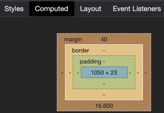
How did this value come about? The calculation formula for the considered CSS property (margin-top) of the HTML element (h2) is:
Multiply the em value (2) by the actual font-size value in px of the HTML element to be styled (20). For our example, this means: 2 * 20px = 40px.
What about margin-top for the h3 element in the example? The value in the end is 46.8px.
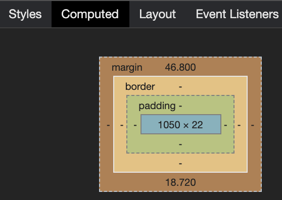
Why is that? We haven’t declared a font-size value, as we did with the h2 element. However, every element has a derived value — this is in the nature of things in CSS.
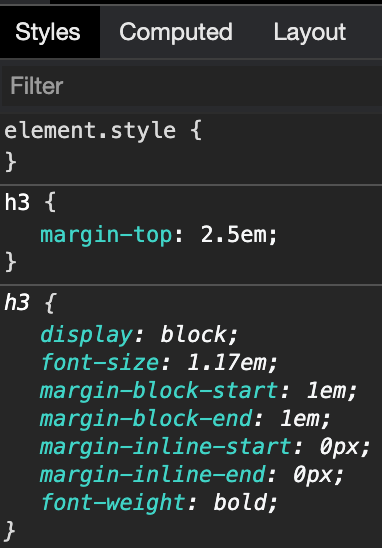
As we can see, our h3 element has a default font-size value of 1.17em. OK, this is no px value, either. We have to go up the parent elements hierarchy until we find a px value.
With the help of DevTools, we find out that the body element has an absolute font-size value derived from browser default values since we haven’t specified a custom value.

With this information, our concrete value can be calculated: 2.5 * 1.17 * 16 = 46.8px.
The next example demonstrates that em is not exclusive to styling text content; on the contrary, it can be used wherever you can use length units. It may seem a bit alienating at first, but you can style non-textual elements without any problems.
See the Pen CSS Unit em (margin) by Sebastian Weber (@doppelmutzi) on CodePen.
CSS unit rem
The font-related relative unit rem stands for “root em.” It correlates with the font-size of the root element of the browser (normally the html element). It’s easy to determine:
Multiply the rem value by the actual font-size value in px of the browser’s html element.
Here’s an example.
See the Pen CSS Unit rem by Sebastian Weber (@doppelmutzi) on CodePen.
The calculated margin-top value of the h2 element is 32px because the defined rem value (2) is multiplied by the absolute font-size value of the html element (16px). Because we haven’t provided a selector to define the font-size of the html element, it is a browser default.
For most (desktop) browsers, the default is 16px. But to find out for sure, you can leverage the DevTools again.
Browser support is good. It can be used without problems except you have to develop for legacy browsers.
Working with em
It is a good idea to check out the W3C CSS standard documentation from time to time. Here, you can see that the font-size property gets inherited from the HTML parent hierarchy.
Therefore, working with em can be tricky:
- Every HTML element inherits its
font-sizevalue from its parent HTML element - If an
em-basedfont-sizeis set for the root element (html), thepxvalue results from multiplication with the browser’s default value. Some browsers allow for defining user values in settings that are then used
The consequence is that browser font settings can potentially influence every em value through inheritance. From an accessibility standpoint, this is crucial to support users that rely on zooming.
However, this might lead to a mostly unwanted behavior in nested elements styled with em values.
See the Pen em - inheritance problematic by Sebastian Weber (@doppelmutzi) on CodePen.
In our example, the font-size of deeper nested elements is larger than expected. Why is that?
- The
font-sizefor level 1liis14px:1.4 (li selector) * 10px (inherited font-size from body)
- The
font-sizefor level 2liis19.6px:1.4 (li selector) * 14px (inherited from level 1 li)
- The
font-sizefor level 3liis even bigger at27.44px1.4 (li selector) * 19.6px (inherited from level 2 li)
To solve this issue in a way that ensures all li elements have the same font size, you could add another selector.
li li { font-size: 1em; };
Keep this in mind for your CSS design. You most likely don’t want to use em in such a scenario; instead, use rem.
Working with rem
Determining the calculated px value for a CSS property using a rem value is easy: you have to multiply the rem value by the px value of the html element. Use the DevTools (Computed tab) to find out whether you have set the value.
The list below provides greater detail on how the px value of the html element is determined:
- If you haven’t defined a custom
pxvalue for thehtmlelement, then thepxvalue is inherited from the browser settings or the browser default values - If you define the
font-sizeof thehtmlelement with apxvalue, then this is what’s used for the calculation - If you define the
font-sizeof thehtmlelement with anemor%value, the actualpxvalue is calculated with the help of the browser font settings or default values - If you define the
font-sizeof thehtmlelement with aremvalue, thepxvalue of thehtmlelement is the result of multiplication with the browser font size settings or default values
The consequence is that browser font settings can influence every rem value in the CSS design. Using rem does not cause an “inheritance problem” of font-size, as you can see in the next example.
See the Pen CSS Unit rem - no inheritance effects by Sebastian Weber (@doppelmutzi) on CodePen.
font-size definitions in the parent hierarchy are irrelevant because rem values are always correlated with the (calculated) px value of the single html element.
When to use rem and em
Using rem and em goes hand in hand with the topics of responsive design, usability, and accessibility.
The advantage of rem is unified sizing without font-size inheritance. As an application designer, you can react to user font settings in order to present content appropriately. This is important so as not to exclude users relying on an accessible design. When a user increases the font size, you have the opportunity to retain the integrity of the layout, e.g., text does not get squeezed into a small container of fixed width.
em is a powerful tool in the belt of every CSS developer. The underlying principle to style an element is to determine “sizing values” (e.g., margin, width) depending on font-size values of parent elements. Therefore, it is not limited to the root element (html).
One of the main benefits of em is its ability to establish proportional relationships between design elements within a context (e.g., a button or teaser module). Usage of em goes hand in hand with the issues of contextual scalability and responsive design. The next example demonstrates how em can be used for responsive component design.
See the Pen Responsive buttons with em unit by Sebastian Weber (@doppelmutzi) on CodePen.
The button component responsive structure is defined with the button selector. border, padding, and border-radius utilize relative units that relate to the defined font-size value. The different button sizes are defined with the concrete class selectors (e.g., size-l).
Since the font-size values are also em units, the concrete contextual value is derived from the concrete px values defined with the main and footer selectors.
The benefit of this approach is that you can easily reuse such components in different contexts. You just have to define different font-size values for the different context containers, and then inheritance does the rest.
Relative CSS unit %
In CSS, percent (%) is not a length unit per se but a data type. Using it feels like a length unit because you can apply it everywhere where you can use px, em, etc. So it’s fair to mention it in this context.
This data type always refers to a fraction of the parent component. A length defined in percentage is based on the length (computed value in px) of the same property of the parent element. The following example illustrates this:
  main {
    width: 400px;
    height: 50%;
  }

  h1 {
    width: 50%;
  }

  <body>
    <main>
      <h1>hello world</h1>
    </main>
  </body>
The computed width of the h1 element is half of its parent element main, i.e., 200px. If the parent container is the body element, then the percentage always refers to the size of the browser viewport. In our case, the computed value of the main element’s height property is half the height of the computed value of the viewport container.
Let’s take a closer look at some nitty-gritty details. In the following CodePen, the gray background containers are the parent elements for the h2 elements (the blue background).
See the Pen CSS percentage demo by Sebastian Weber (@doppelmutzi) on CodePen.
The default behavior for a block-level element without a user-defined width is to occupy the available horizontal space of the parent container, as you can see with demo 1. The horizontal padding (the dark-blue background) of our h2 is not added to the total width.
However, as you can see with demo 2, defining an explicit width: 100% causes a horizontal scrollbar to be displayed. Why is that?
In contrast to demo 1, wherein the default width has the value auto, defining a percent value includes padding, margin, and border in its calculation and enables children to overgrow the width of their parent container. You can read about it in the CSS spec.
In demo 3, we specify width: 100%, too, but we do not have a horizontal scrollbar. This is because the children’s border and padding is not adding to the horizontal spacing due to the fact that we changed the default from box-sizing: content-box to box-sizing: border-box. It is not unusual that you define a global selector to use border-box throughout your CSS design.
With demo 4 and demo 5, you can see the percentage does not necessarily relate to the direct parent element but an element further up in the parent tree.
Viewport units
Percentage values (%) always refer to the parent element. However, viewport unit values represent a percentage of the current browser viewport.
Values of viewport units are determined based on the viewport container’s width (vw) and height (vh). The value range is between 1 and 100:
1vwis 1 percent of the viewport’s width; similarly,1vhis 1 percent of the viewport’s height100vwis 100 percent of the viewport’s width; likewise,100vhis 100 percent of the viewport’s height
The most obvious use case for viewport units is to use them for top-level containers that take occupy space in relation to the viewport size; there is no cascading or influence by parent elements involved. In contrast to %, for viewport units, it does not matter where in the markup the element to be styled resides.
So 100vw can be used for full-width sections, right? Yes — but with a caveat.
The border and margin of the element are not considered, so as you can see in the next example, the header container exceeds the browser viewport, and a horizontal scrollbar is shown. The article container solves this problem by setting the box-sizing property from its default value of content-box to border-box.
See the Pen Viewport units demo by Sebastian Weber (@doppelmutzi) on CodePen.
For the main container, we prevent this issue with another approach by using calc() to subtract the border widths and margins on both sides.
If your use case is to get a full-width section, it’s easier to use the good old width: 100% (the default with display: block), as you can see in the footer container. Using width: 100% is superior because older browsers can experience issues when scrollbars are shown.
A more beneficial use case is to use the vh unit in relation to the height of the viewport. If you want to stretch a container to the height of the viewport, vh is superior to % because the latter relates to the parent. Thus, with the % unit, you have to use fixed layout techniques to ensure the parent container fills the height of the viewport.
The following sticky footer example leverages vh to have a component at the bottom of the viewport.
See the Pen sticky footer with flexbox by Sebastian Weber (@doppelmutzi) on CodePen.
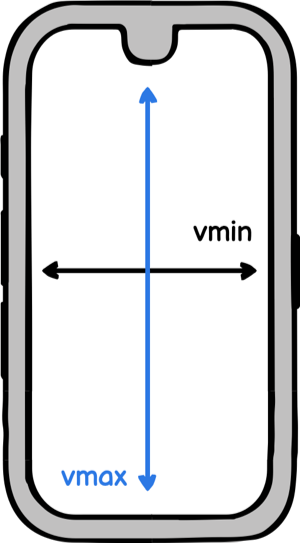
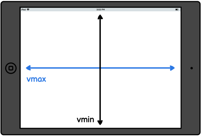
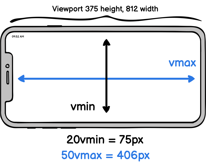
Associated units are vmin and vmax:
20vminrelates to20vwor20vh, whichever is smaller10vmaxrelates to10vwor10vh, whichever is larger
Let’s rephrase the explanation: as an example, 10vmin will resolve to 10 percent of the current viewport width in portrait orientations, and 10 percent of the viewport height on landscape orientations.
The following picture gives an example on how the final pixel value is calculated for both units.
What is it good for? Not many use cases come to mind — but it’s another tool in your bag as a web developer.
In some circumstances, it serves you better than media queries. With media queries, you have to think in “gates.” Due to the almost infinite number of devices and form factors, however, this approach does not always scale. You can think of vmin and vmax more as fluid length units.
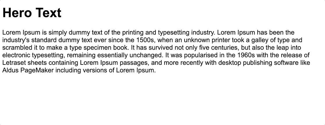
When you search for use cases, you often come across responsive hero text components. The next CodePen demonstrates that vmin improves the responsive behavior in contrast to vw. In this case, the ratio of the text to the screen width in landscape mode is more coherent.
See the Pen Hero text with vmin by Sebastian Weber (@doppelmutzi) on CodePen.
Browser support is very good, even for Internet Explorer 9, except you want to use vmax.
However, the devil’s in the details when it comes to mobile devices. The calculation especially of vh is not consistent in all mobile browsers because the spec is vaguely formulated. There are some tricks to cope with it, however.
Common use cases
In this section, I want to show some responsive patterns that are possible by combining the different relative units.
Combining em and rem for local and global scaling
This Code Pen by Chris Coyier impressively demonstrates, with the help of sliders, how rem and em can be leveraged for global (i.e., the whole website) and local (i.e., inside a module) scaling. This shows how you can build your layout with inclusive design in mind by reacting to the font size settings of the user.
See the Pen Em AND Rem by Chris Coyier (@chriscoyier) on CodePen.
There’s a subtle difference between this approach and the button example we discussed above. Using rem values instead of px values — and, in addition, not defining a fixed font-size value for the root element — respects user font size settings to improve accessibility.
Full-width containers in limited-width parents
Consider a scenario in which the structure of the markup is not fully under your control. If you work with some kind of CMS, you may find yourself in a situation where you have a limited-width container, but you want to make children elements break out.
The next CodePen shows how to break out of a bounded container and span the entire horizontal space with the help of vw.
See the Pen Full-width containers in limited-width parents by Sebastian Weber (@doppelmutzi) on CodePen.
The important code is part of the .break-out selector. If you’re curious about the code, take a look at the following derivation of margin-left:
  .break-out {
    // 500px because of the max width of the container
    margin-left: calc(-100vw / 2 + 500px / 2);
    // replace 500px with 100%
    margin-left: calc(-50vw + 50%);
  }
You can read detailed explanations with different scenarios and techniques at CSS-Tricks and Cloud Four.
Fluid typography
Let’s put it in a nutshell — most of the time, text content plays a very important part on the page. Due to the variety of screen sizes, fluid typography has grown more and more important.
Fluid typography that uses viewport units (vw, vh) dynamically adjusts the font size to the viewport. This leads to a more harmonic and suitable presentation in contrast to responsive typography based on breakpoints.
Here is a naive example:
  h1 { font-size: 4vw; }
  p { font-size: 2vw; }
But wait — a better approach is to do the following:
html { font-size: 3vw; }
Why? Because we leverage the Browser’s default values with accessibility in mind. The HTML tags for h1 and p are defined with relative font-size values (em), so you don’t have to think about relativity between paragraph text, headlines, etc. Of course, you can define your own font sizes if you wish to optimize your design.
But our approach has a problem: the font size is too tiny for small viewport widths.
So we need some lower and upper bounds so that the text neither shrinks nor grows too much for small or large screen widths, respectively. We can use media queries to define such boundaries, but then we wind up with these inharmonious jumps between the breakpoints.
A better approach is to omit media queries in the first place.
See the Pen Fluid typography by Sebastian Weber (@doppelmutzi) on CodePen.
The algorithm used in the CodePen above is based on the approach described by CSS-Tricks. Christine Vallaure does a nice job of explaining the rationale behind this algorithm.
  html {
    font-size: calc([minimum size] + ([maximum size] - [minimum size]) * ((100vw - [minimum viewport width]) / ([maximum viewport width] - [minimum viewport width])));
  }
Tim Brown also transfers the concept to fluid line-height.
See the Pen CSS calc lock for line-height by Tim Brown (@timbrown) on CodePen.
Custom scroll indicator with vh
The following example shows a clever trick to combine % with vh units to create a pure CSS scroll indicator.
See the Pen CSS only scroll indicator by Mike (@MadeByMike) on CodePen.
Conclusion
Understanding relative units is key for fluid layouts or responsive designs (call it whatever you want) that enable CSS to cope with the virtually unlimited variety of viewport sizes and dpi.
Font-based units might feel odd at first, but after gaining some experience, you’ll recognize their benefit over absolute units. Viewport units, especially vh, are useful, but it’s important to understand when to use them and when to use the good old % data type.
An all-too-often overlooked aspect of developing websites is to make them accessible. By their very nature, these relative units respect user-specific font sizes and zoom settings.
There are more relative units on the horizon, but no browser currently supports them. Thankfully, we can already work very well with the current representatives.