Master Flexbox Scaling by Understanding flex-grow, flex-shrink, and flex-basis
Inspired by an article why flex-grow is weird, I’ve developed a small tool (Codesandbox) to explore how different properties of flex items work separately or in combination. You can reproduce all examples of this article with my tool. I hope you find it useful.
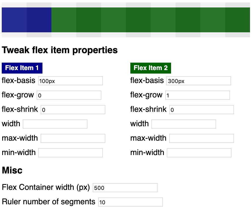
In case this tool is not intuitive for you, this article breaks down different combination of flex-basis, flex-grow, and flex-shrink to show how these flexibility properties can be leveraged for responsive flexbox layouts.
flex-basis
Take a look at the next screenshot.
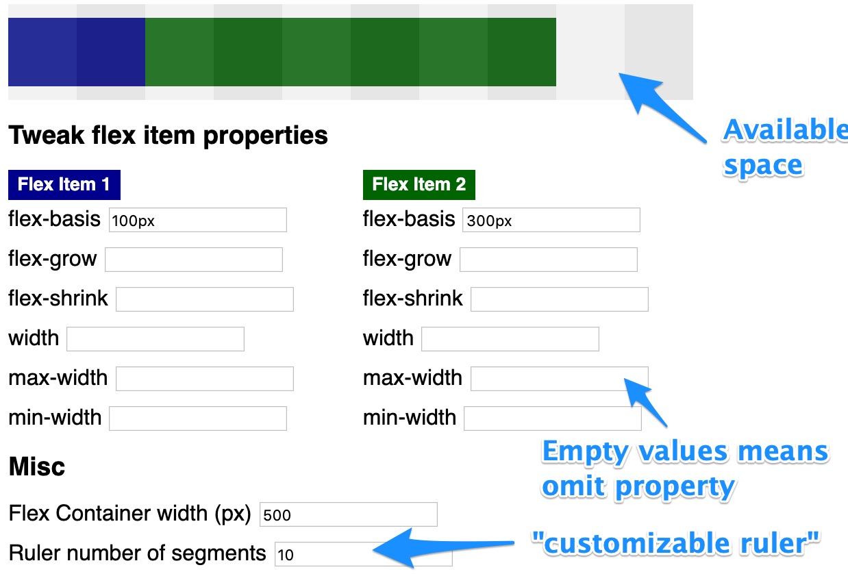
First of all, the blue annotations explain how the tool works. In this example, the 2 flex items (blue = flex item 1 and green = flex item 2) do not consume the whole available space of the flex container (width of 500px). 100px free space is represented by 2 grey-scaled squares (500px / 10 segments). The grey-scaled ruler is meant as utility to visualize how many "portions" of the flex container are free for distribution.
The next example shows both width and flex-basis.
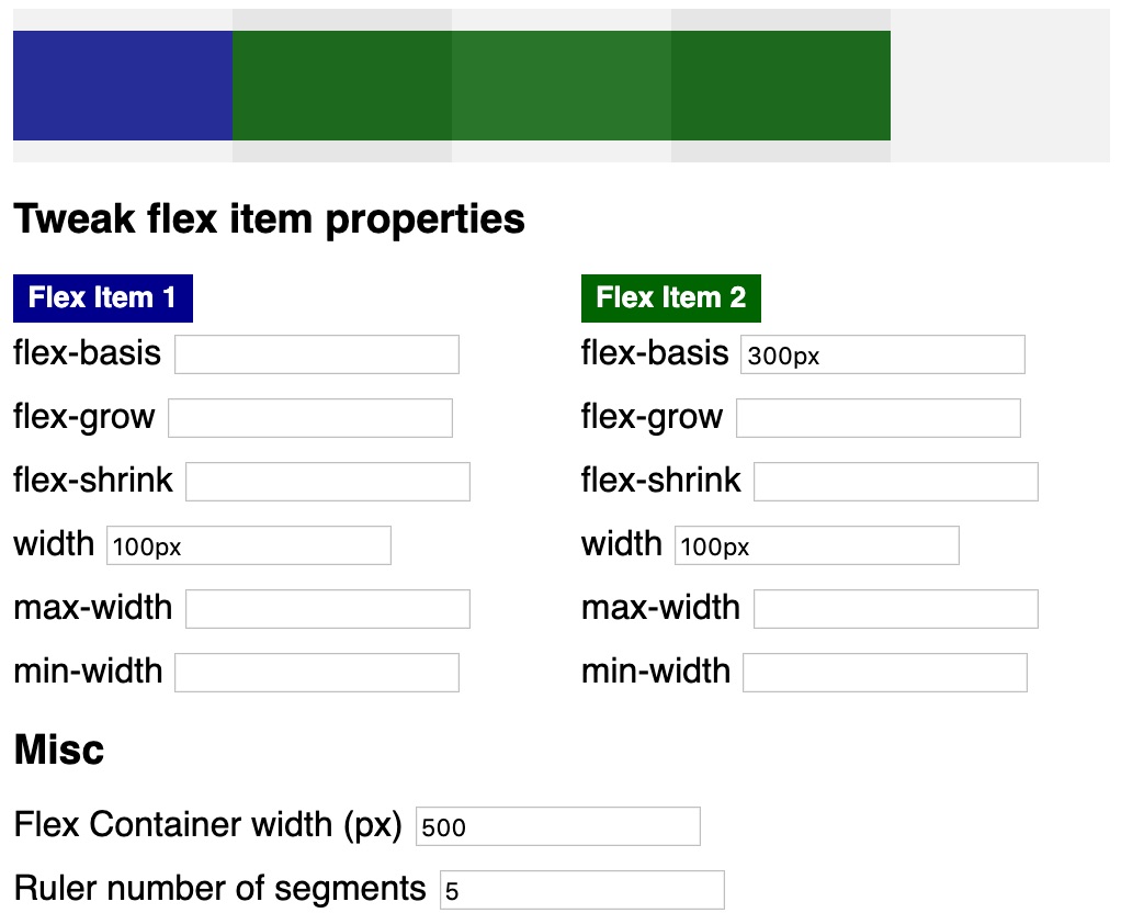
So what is the difference between width and flex-basis In case you specify both properties (green flex item), width is ignored. The blue flex item does not specify flex-basis so the item automatically gets the default property (flex-basis: auto). In such a case, width is used for scaling.
Dave Geddes compiled an in-depth explanation on the difference between width and flex-basis.
flex-shrink
As you can see in the next example, flex-basis can cause an overflow of the flex container.
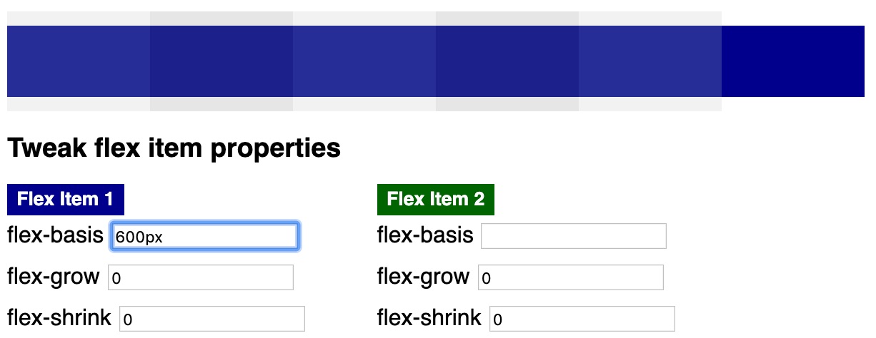
However, specifying a flex-shrink value fixes the problem by allowing the blue flex item to shrink.
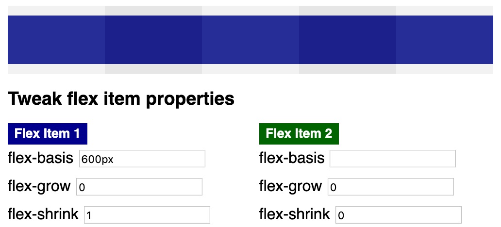
You can specify flex-shrink for every flex item. In the next example, flex item 1 shrinks 4 times more than flex item 2.
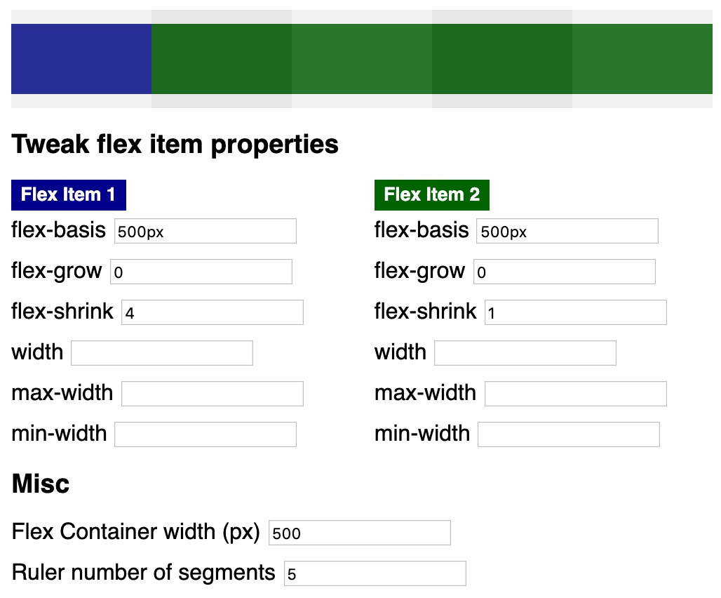
As you can see, the blue flex item consumes 1 spot (100px) and the green flex item consumes 4 spots (400px). How come?
The following code snippet shows the calculation for the available space for the aforementioned example.
// pseudo algorithm for flex-shrink

const flexItem1Width = 500
const flexItem2Width = 500
const flexContainerWidth = 500
// 500 - 500 + 500 = | -500 | = 500px
const spaceToDistribute =
  Math.abs(flexContainerWidth - flexItem1Width + flexItem2Width)
const flexItem1ShrinkFactor = 4
const flexItem2ShrinkFactor = 1
// 5
const totalShrinkValues = flexItem1ShrinkFactor + flexItem2ShrinkFactor
// 100px
const distributionSpot = spaceToDistribute / totalShrinkValues
// 500px - (4 * 100px) = 100px
const flexItem1ComputedWidth =
  flexItem1Width - (flexItem1ShrinkFactor * distributionSpot)
// 500px - (1 * 100px) = 400px
const flexItem2ComputedWidth =
  flexItem2Width - (flexItem2ShrinkFactor * distributionSpot)
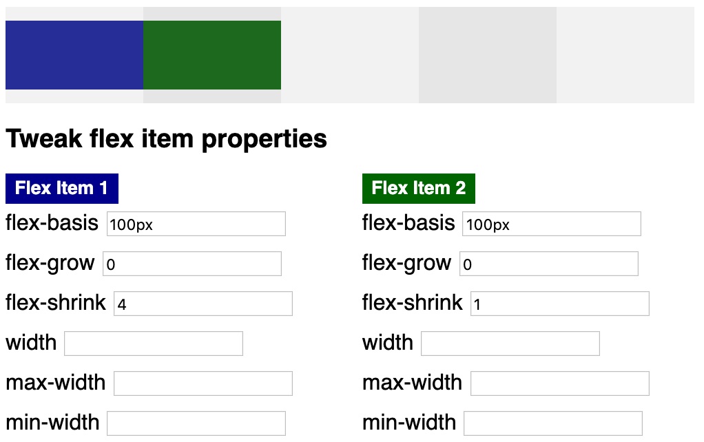
Downsizing only happens if required. In the following example, the flex-basis values are respected.
flex-grow
Of course, you can specify multiple flex item properties. The next screenshot shows that providing flex-shrink and flex-grow values is totally legit.
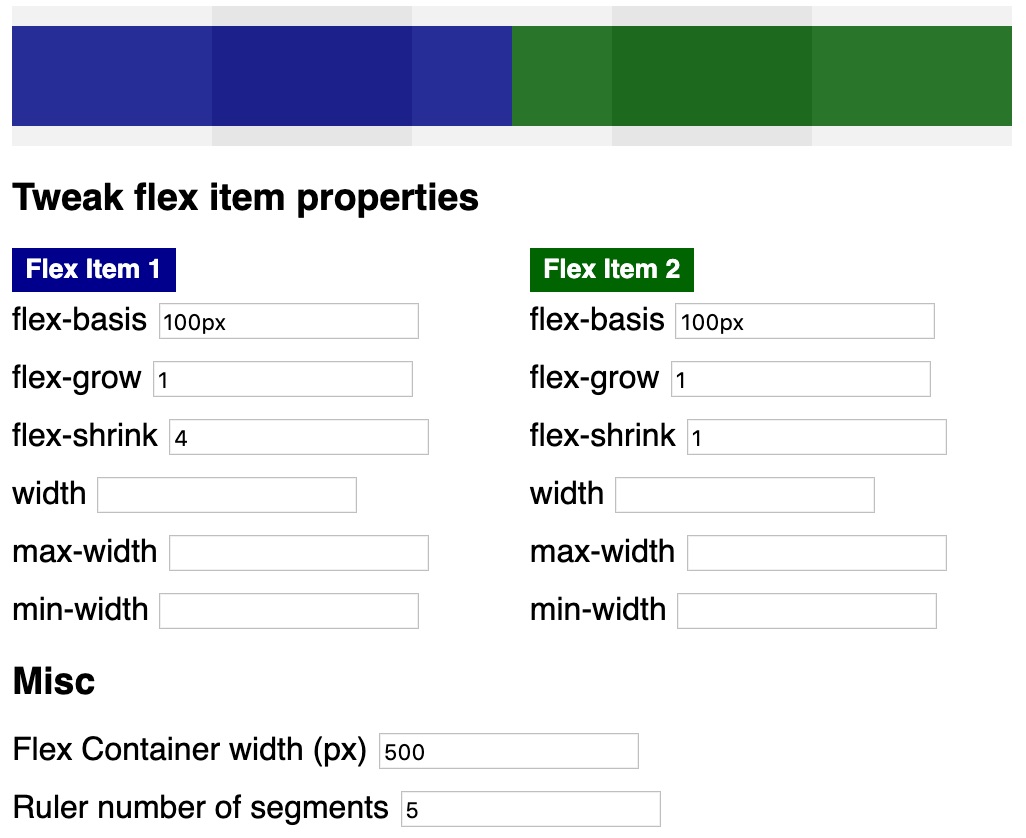
In this case, only flex-grow values take effect causing both flex items to grow equally (because of same factor 1). Obviously, you can also specify different flex-grow values for your flex items and the behavior is exactly as you expect it (same as with flex-shrink but growing instead of shrinking).
Finally, let’s take a look at the following example to examine the calculation formula for flex-grow, too.
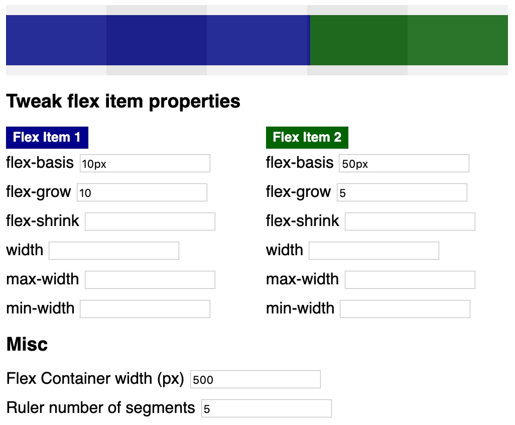
The algorithm is nearly the same as for flex-shrink.
// pseudo code for flex-grow algorithm

const flexItem1Width = 10
const flexItem2Width = 50
// 10px + 50px - 500px = | -440px | = 440px
const spaceToDistribute = 440
const flexItem1GrowFactor = 10
const flexItem2GrowFactor = 15
// 15
const totalGrowValues = flexItem1GrowFactor + flexItem2GrowFactor
// 440px / 15 = 29,3333
const distributionSpot = spaceToDistribute / totalGrowValues
// 10px + (10 * 29,3333px) = 303,33333px
const flexItem1ComputedWidth =
  flexItem1Width + (flexItem1GrowFactor * distributionSpot)
// 50px + (5 * 29,3333px) = 196,6666px
const flexItem2ComputedWidth =
  flexItem2Width + (flexItem2GrowFactor * distributionSpot)
min-width and max-width
Let’s take the last example and specify max-width values for both flex items, too.
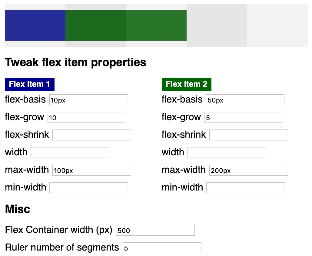
As you can see, max-width values are respected. That’s why flex item 1 does not grow beyond 100px (it does not scale to 303,333px). In addition, flex item 2 does not scale beyond 200px (it does not scale to 196,6666px).
Finally, let’s see how different flex item properties behave.
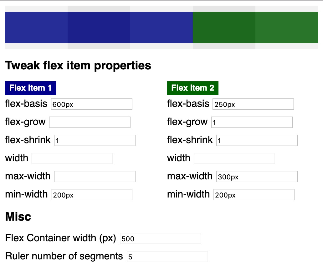
In this example, flex item 1 cannot consume its hypothetical main size of 600px. Due to the fact that a flex-shrink value other than 0 or auto is specified, the blue flex item is allowed to shrink. However, it does not shrink beyond its min-width value (200px). In the end, its width is 300px and that’s because of the properties of flex item 2. The green flex item cannot take its flex-basis width (250px). Due to flex-grow and flex-shrink values the item is allowed to shrink and grow. Growing is not possible because there is no available free space within the flex container. So, the max-width value is irrelevant. However, min-width is respected and the green flex item takes up 200px space.
flex Shorthand
Manuel Matuzovic explains in detail why flex-grow: 1 is not the same as flex: 1.
This is because flex is the shorthand for flex-grow, flex-shrink, and flex-basis. It is tricky because you can use it with one, two, and three values. E.g., if you use only one value, the other values are implicitly set (e.g., by default values).
Summary and Lessons Learned
It helped me a lot to understand scaling of flex items by developing this tiny tool. I can encourage others to do the same for learning purposes and sharing knowledge.
For me, a good understanding of flex-grow, flex-shrink, and flex-basis in combination with known width, min-width, and max-width properties allows for developing better (in terms of responsive and robust) flexbox layouts.
